Pro Tip: Want a Head Start? You can build standard grids with the free version, but WP Team Manager Pro unlocks Smart Image Cropping, Popup Modals, and League Management instantly. Start Your 7-Day Free Trial – No Charge Today ->14 Days Money Back Guarantee!
Introduction The Team Generator is a powerful tool that allows you to build custom team displays without writing complex code. Instead of memorizing shortcode parameters, you can use this visual builder to select your settings and generate a unique shortcode to paste anywhere on your site.
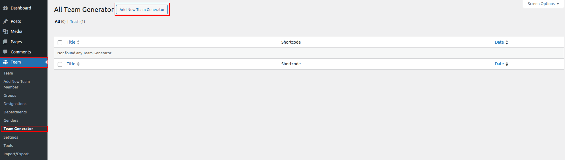
Step 1: Create a New Generator
- Navigate to Team Manager > Team Generator in your WordPress dashboard.
- Click the “Add New Team Generator” button.
- Give your generator a Title (e.g., “Homepage Management Team”) so you can find it later.
Step 2: Configuring a Team Generator
This section controls the logic of which members appear.
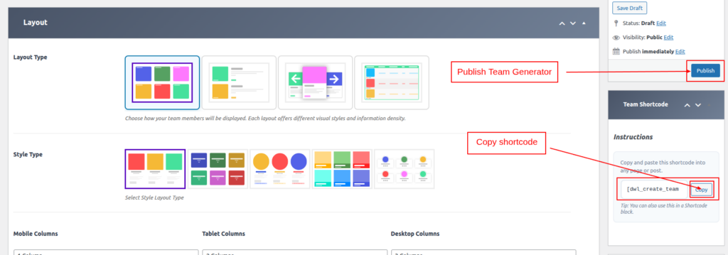
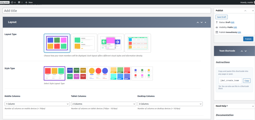
- Layout Type: Choose between Grid, List, Slider, or Table.
- Note: Isotope and Masonry layouts are available in the Pro version.
- Style Type: Select a visual style for the member cards
- Responsive Columns: Set specific column counts for different devices:
- Mobile Columns: Number of columns for devices under 768px.
- Tablet Columns: Number of columns for devices between 768px – 1024px.
- Desktop Columns: Number of columns for devices over 1024px.
💡 Quick Tip: If you want to show only a specific department, use the “Shortcode Settings” tab to select a category.
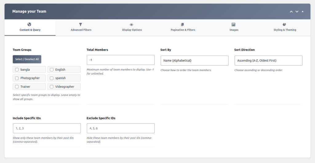
Step 3: Customize the Content & Query (Shortcode Settings)
- Team Groups
Select one or more team groups to filter which members are displayed. - Total Members
Specify the maximum number of team members to display. - Sort By
Choose the field used to sort the team members. - Sort Direction
Select the order in which the members are sorted (ascending or descending). - Include Specific IDs
Enter the IDs of team members that should be explicitly included. - Exclude Specific IDs
Enter the IDs of team members that should be excluded from the display.
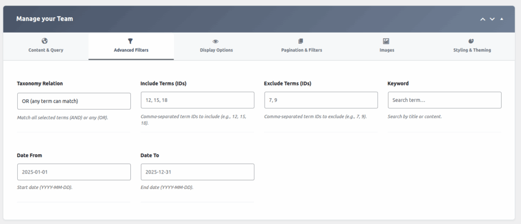
Step 4: Customize the Advanced Filters (Shortcode Settings)
Click the “Shortcode Settings” tab to control the look and feel.
- Taxonomy Relation
Select how multiple taxonomy terms are combined when filtering results
(for example: Match all selected terms (AND) or any (OR).). - Include Terms (IDs)
Enter the IDs of taxonomy terms that should be included in the results. - Exclude Terms (IDs)
Enter the IDs of taxonomy terms that should be excluded from the results. - Keyword
Enter a keyword to search within member names or content. - Date From
Specify the start date to filter results from this date onward. - Date To
Specify the end date to filter results up to this date.
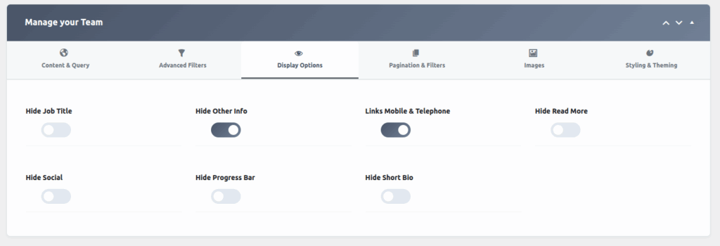
Step 5: Select Visible Fields
- Hide Job Title
Enable this option to hide the member’s job title from being displayed. - Hide Other Info
Enable this option to hide additional member information such as contact details or metadata. - Links Mobile & Telephone
Enable this option to make the mobile and telephone numbers clickable (tap-to-call links). - Hide Read More
Enable this option to hide the “Read More” button or link from the member profile. - Hide Social / Hide Progress Bar
Enable this option to hide social media links and the progress bar from the display. - Hide Short Bio
Enable this option to hide the short biography or summary text of the member.
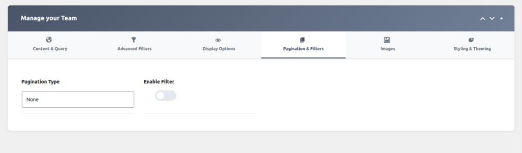
Step 6: Pagination & Filters
- Pagination Type
Select the pagination style used to navigate through team members
(for example: numbered Pagination, Ajax load more button). - Enable Filter
Enable this option to allow users to filter team members based on available criteria.
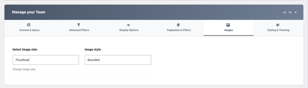
Step 7: Select Images
- Select Image Size
Choose the size of the image to be displayed for each team member. - Image Style
Select the visual style or layout applied to the member images
(for example: square, circle, rounded corners).
Use the “Detail Page Field Selection” area to toggle specific information on or off.
- Uncheck fields you want to hide (e.g., if you don’t want to show email addresses on the public grid).
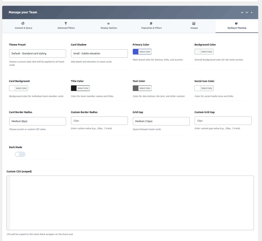
Step 7: Customize the Styling & Theming
- Theme Preset
Select a predefined theme style to quickly apply a consistent design across all cards. - Card Shadow
Enable or choose the shadow style applied to each card for visual depth. - Primary Color
Set the main accent color used throughout the layout. - Background Color
Choose the background color of the overall section or container. - Card Background
Specify the background color for individual member cards. - Title Color
Set the color used for member names or titles. - Text Color
Define the color used for general text content. - Social Icon Color
Choose the color applied to social media icons. - Card Border Radius
Select the border radius style for the card corners. - Custom Border Radius
Enter a custom border radius value to override the default setting. - Grid Gap
Choose the spacing between grid items (cards). - Custom Grid Gap
Enter a custom spacing value to override the default grid gap. - Dark Mode
Enable this option to apply a dark-themed color scheme. - Custom CSS (Scoped)
Add custom CSS styles that apply only to this component or section.
Step 8: Generate & Publish
- Click the Publish button on the right sidebar.
- Look for the “Shortcode” box (usually at the bottom or top right).
- Copy the code.
- Paste it into any Page, Post, or Text Widget on your site.