Pro Tip: Want a Head Start? You can build standard grids with the free version, but WP Team Manager Pro unlocks Smart Image Cropping, Popup Modals, and League Management instantly. Start Your 7-Day Free Trial – No Charge Today ->14 Days Money Back Guarantee!
How to Set Up the Table Layout:
The Table Layout provides a structured, grid-based presentation of your team members or content. It allows you to organize profiles into rows and columns, offering a clean and professional appearance suitable for detailed listings or comprehensive team overviews.
The layout options (as shown in the provided screenshot) enable you to customize the appearance and style of your table for optimal visual appeal and usability.
1. Access the Team Generator:
- Navigate to the WP Team Manager plugin in your WordPress dashboard.
- Select the ‘Team Generator’ option.
2. Choose Table Layout:
- In the layout options, select the Table Layout option to structure your team profiles in a tabular format.
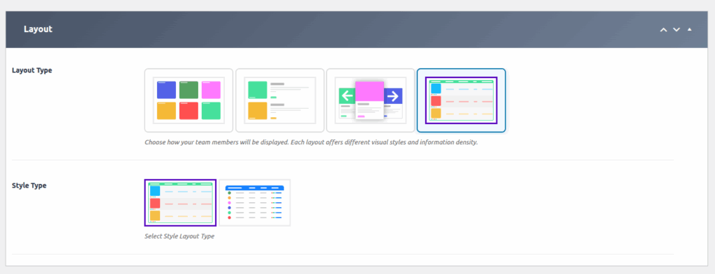
3. Select Layout Type:
- From the Layout Type options, choose the table style that best fits your design:
- Options may include different grid styles, with variations in borders, spacing, and overall appearance.
- Click on your preferred style to apply it.
4. Choose Style Layout Type:
- Under Style Type, select the visual theme for your table:
- Styles may include clean, colorful, dark mode, minimalistic, etc.
- Pick the style that complements your website’s branding.
5. Configure Columns & Rows:
- Define how many team profiles you want per row:
- e.g., 2, 3, 4 columns per row.
- Adjust the row height and column width if available for more precise control.
Step 6: Customize Manage your Team
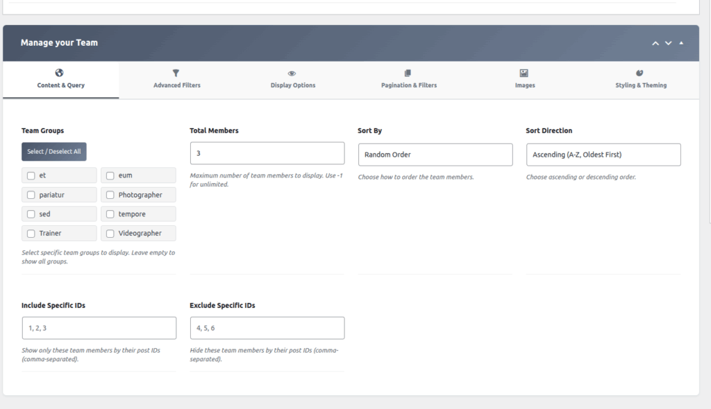
Customize the Content & Query
| Option | Description |
| Team Groups | Select one or more team groups to filter which members are displayed. |
| Total Members | Specify the maximum number of team members to display. |
| Sort By | Choose the field used to sort the team members. |
| Sort Direction | Select the order in which the members are sorted (ascending or descending). |
| Include Specific IDs | Enter the IDs of team members that should be explicitly included. |
| Exclude Specific IDs | Enter the IDs of team members that should be excluded from the display. |
Step 7: Customize the Advanced Filters
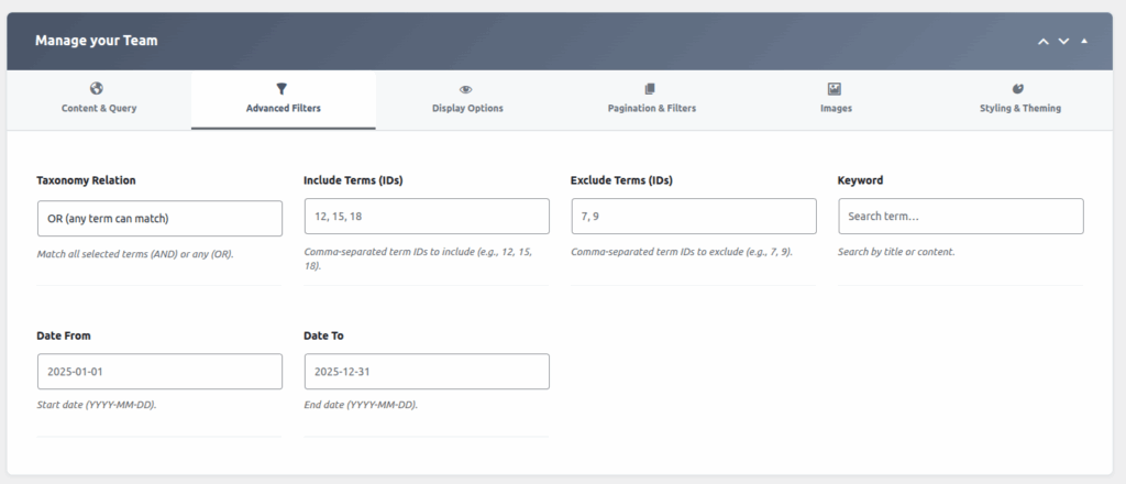
Filtering & Sorting:
| Option | Description |
|---|---|
| Taxonomy Relation | AND / OR relation among selected terms |
| Include Terms (IDs) | Filter members by terms to include |
| Exclude Terms (IDs) | Exclude members based on terms |
| Keyword Search | Search team members by keyword |
| Date Range | Filter by start and end date |
| Order By & Direction | Order team members (Name, Date, Random) & direction |
Step 8: Select Visible Fields
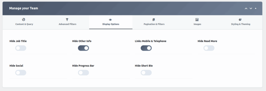
Display Options:
| Option | Description |
|---|---|
| Hide Job Title | Toggle to hide or show job titles |
| Hide Other Info | Toggle to hide or show additional information |
| Hide Read More | Toggle to show or hide ‘Read More’ links |
| Hide Social / Hide Progress Bar | Enable this option to hide social media links and the progress bar from the display. |
| Hide Short Bio | Enable this option to hide the short biography or summary text of the member. |
Step 9: Pagination & Filters
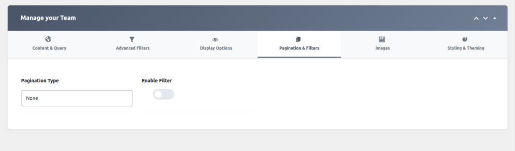
Pasination & Filters:
| Option | Description |
| Pagination Type | Select the pagination style used to navigate through team members (for example: numbered Pagination, Ajax load more button). |
| Enable Filter | Enable this option to allow users to filter team members based on available criteria. |
Step 10: Select Images
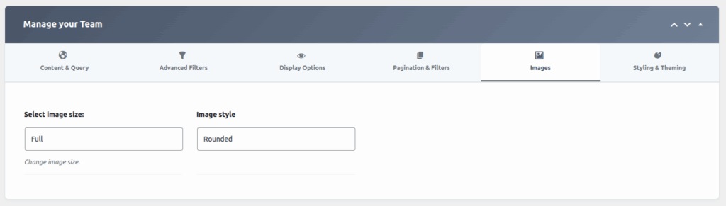
Image Settings:
| Option | Description |
|---|---|
| Image Size | Choose image size (Full, Thumbnail, Custom) |
| Image Style | Boxed, Rounded, Circle styles |
Additional Customization Options:
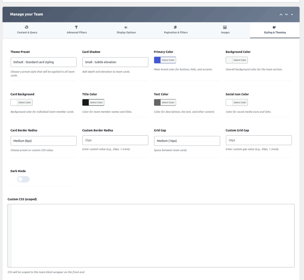
Styling & Theming:
| Option | Description |
| Theme Preset | Select a predefined theme style to quickly apply a consistent design across all cards. |
| Card Shadow | Enable or choose the shadow style applied to each card for visual depth. |
| Primary Color | Set the main accent color used throughout the layout. |
| Background Color | Choose the background color of the overall section or container. |
| Card Background | Specify the background color for individual member cards. |
| Title Color | Set the color used for member names or titles. |
| Text Color | Define the color used for general text content. |
| Social Icon Color | Choose the color applied to social media icons. |
| Card Border Radius | Select the border radius style for the card corners. |
| Custom Border Radius | Enter a custom border radius value to override the default setting. |
| Grid Gap | Choose the spacing between grid items (cards). |
| Custom Grid Gap | Enter a custom spacing value to override the default grid gap. |
| Dark Mode | Enable this option to apply a dark-themed color scheme. |
| Custom CSS (Scoped) | Add custom CSS styles that apply only to this component or section. |
Final Steps:
Once you finish customizing your table layout, save your settings. Embed the shortcode into your webpage, and your structured, styled team table will be live on your site.
Need Further Assistance?
For advanced styling, custom CSS, or troubleshooting, consult the plugin’s documentation or support resources.
Create a professional, organized team showcase with your Table Layout!